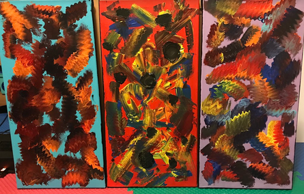
Triptych
|
Exhibition TextTitle: Enigmatic Self
Medium: Acrylic on Canvas Size: 61.0 cm x 30.5 cm Time of Completion: April 2018 Primarily inspired by the works of both Franz Kline and Jackson Pollack, Enigmatic Self intends to portray the confusion associated with self-evaluation alongside an idea of skewed perception. Although the brushstrokes and various colors are actually intended to represent certain aspects of my personality, the overall intention of this painting is to showcase that my interpretation of myself, my impact on society, and my future may be different from another’s understanding of my characteristics. |
Critical Investigation/Artistic Inspiration
|
My triptych painting piece was primarily inspired by the abstract expressionism movement that took place during the 1930s in both the United States and some parts of Europe. As a result of severe politically instability during this time period, several artists reacted with abstract expressionism in attempts to combat the chaos and ruggedness of their surrounding environment. Artists such as Jackson Pollock, Willem de Kooling ,and Franz Kline - of which were previously subjected to creating provincial and generally stereotypical artwork - started to expand past the conventional boundaries of certain artworks at the time. The idea of avante garde artwork was quickly becoming popular amongst the artist community, and paved the way for the United States to be internationally recognized as a hub for modern artwork. Heavily inspired by the Surrealist art movement, abstract expressionism similarly showcased feelings of both trauma and anxiety, but in a new style than previously seen. In addition to this, abstract expressionism captured aspects of figurative painting that similarly grew more commonplace during the 1930s.
From this art movement, I primarily took inspiration from artists Jackson Pollock and Franz Kline, both of which were proclaimed abstract expressionists. Franz Kline was an American artist most known for his large black and white works, of which were intended to showcase motifs considering confidence and similar emotions. Originally a realist, following his meeting with Willem de Kooling, Franz Kline started creating increasing amounts of abstract artworks. His various abstract works - of which include the series of black and white pieces - frequently contained a series of motifs, structure, powerful contrasts, as well as hidden messages. However, as Kline’s work continued to increase in popularity, Kline grew considerably reluctant to share the hidden meanings of his works to the public. Even today, several art critics debate the intentions behind his works such as, “Black and White No. 2” (1960), and “Chief” (1950). These two pieces were major inspirations for my triptych painting, as I felt his technique could express powerful emotion without being overly dramatic or dynamic. Not only this, but his desire to keep the meanings of his works secret also inspired me, as I felt that a key theme of my triptych was to allow the viewer to interpret the meaning of my piece, opposed to being told what it should mean. In addition to Franz Kline, abstract expressionism Jackson Pollock was a primary inspiration to create my triptych painting. Known for his famous ‘drip paintings’ Jackson Pollock was a well known abstract expressionist that used his paintings in order to emphasize an idea of human entrapment and anxiety, as the unusual works were described as being entirely unique and modern within the artist community. The two pieces from Jackson Pollock that I felt most inspired by are formally known as, “Blue Poles,” (1952) and “Mural” (1943). I used these pieces as inspirations for my triptych, as I felt the various methods of distributing paint were unique, and could convey emotion, yet leave ambiguity within my abstract piece. |
|
Planning Phase
|
Planning Sketch #1
Planning Sketch #2
Planning Sketch #3
|
In consideration to my triptych piece, I was unable to follow a typical “Planning Phase” process while initially deciding what my final artwork would incorporate through the various abstract expressionism techniques I had studied during my research phase of this project. Instead, during the planning phase of this piece, I focused on creating various portions of a larger piece. For the most part, I focused on creating smaller aspects of my triptych painting, that would be implemented into the final piece later on. I completed the planning phase in such a way, as I wanted to focus on using intuition, improvisation, and other processes to paint my canvases on the spot. I felt that doing so would allow me to create a considerably more raw and emotional piece, as I wouldn’t attempt to incorporate extremely dynamic or complicated paint strokes that could potentially distract the viewer from the true intentions of my piece.
The first of the three aspects within my triptych piece that I intentionally planned out included the dark void-like spheres that I would later dot throughout my piece. These spheres were intended to represent sorrow and conflict present within my society, and in order to showcase the differing levels of conflict, I intended to create each sphere with a different size. Not only would this allow my piece to appear more diverse - opposed to stagnant and repetitive - but it would also allow me to incorporate colors that could contrast the seriousness brought about my this series of dark circles. I intentionally decided to make these dark voids in the shape of circles, as I felt that considerably organic shapes would provide additional contrasts to my piece, as I assumed that my future brushstrokes would be considerably geometric and straight. This ensures that the circles stand out in multiple ways, of which emphasizes importance, as these sections of the painting would show the most difference when compared to the remaining portions of the three canvases. The second planned aspect of my triptych piece were the uneven and lumpy brushstrokes. Although I didn’t plan out what colors I specifically intended to use for each brushstroke, I knew that this technique was unique and would set my piece apart from my classmates artworks. In addition to this, by incorporating my own techniques - even though I understood they had probably been used before - I could display similar painting methods to that of Jackson Pollock, who also developed his entirely unique techniques within various paintings. I felt that these lumpy brushstrokes provided variety to my piece, and furthermore expressed much softer emotions within my artwork. Finally, during this planning phase of my project, I planned what each color within my piece would convey emotionally. This way I myself could understand what emotions would be represented on each canvas (with this guide acting as a reference of sorts), of which allowed me to ensure that my triptych painting could convey an in-depth and complex theme without requiring extremely dynamic objects/figures. In addition to making my theme more dynamic, these colors having planned emotional connections to them prevented my piece from appearing sloppy or unfinished. As the colors wouldn’t be randomly dispersed across the three canvases, and instead could be placed with intention. |
Process
|
To begin the process of painting my triptych piece, I first applied a base coat of color to each canvas. This was done to ensure that there would be no white spaces within the paintings, even if the paint streaks I applied later on in the process didn’t cover the entirety of the 1 ft by 2 ft canvas. Following the application of this paint coat, I allowed the paintings to dry overnight, so that the paint I would be applying next wouldn’t mix with the background colors. It should also be noted that during this point in my process, I also painted the edges of my canvas black, so that the painting would look considerably more refined and complete. Unfortunately, while applying the black paint along the edges, my brush would occasionally slip and leaves marks along the front of the paintings. These streaks were unintentional, but could not simply be covered by another application of the base coat, as the black was too dark to completely disappear from the canvas face. Thus, I ultimately decided to leave the unintentional streaks alone, as I feared that attempting to correct these errors would only make my canvas appear worse.
Once the base coat along the canvas front and sides had dried overnight, I took the selected tubes of paint that I had decided to use during my planning phase, and lined them up along a table edge so that I wouldn’t accidentally use a color I didn’t want on my canvas. Furthermore, this provided easy access to my materials, so that I could effectively disperse the paint along my canvas - while I could also mix certain colors - before anything had the opportunity to dry out. I started by painting the blue canvas, of which was intended to be the first painting within the set. I initially took colors including orange, red, and some yellows, but later incorporated darker browns and maroons into my piece. In order to place the paint along my canvas, I would simply take a tube of paint, and squeeze a varying amount of paint onto the canvas at different portions of the painting. I would work with one color at a time, but if I needed to mix colors, I would go back to certain paint piles along my painting and squeeze additional colors from paint tubes near the original color. After these piles had been properly dispersed across my canvas, I then took my paint brush and began spreading the paint across the artwork in uneven and lumpy motions. Doing this created a considerably unique paint streak, of which expressed softer emotions than a regular and straight streak of paint could convey. I would work my way throughout my across my painting, ensuring to pull my brush through every paint pile before leaving the canvas to dry. After finishing one series of brush strokes, I would put my painting outside and clean my brush off so that the layer of paint could dry. I cleaned my brush to ensure I wouldn’t accidentally mix colors I didn’t want onto any given canvas. Then, after a layer of paint had completely dried, I would go back and add another series of paint piles along the canvas face. This process would repeat with differing colors until I felt that I couldn’t add anymore paint streaks without damaging the refined quality of my painting. At this point I moved on from my first canvas, and instead began working on completing my third canvas. I ultimately decided to complete this canvas second, as I would be using similar techniques to complete this painting that I used to complete the first painting. In order to complete this canvas, I reapplied the same process that I used in order to complete my first artwork. Although this time, I incorporated more colors into my piece that weren’t present within my first canvas. The third canvas I completed (the painting with the red background) was the hardest for me to successfully do. This was because I instead had to drag the paint piles across the canvas in a straight motion, opposed to an uneven motion that I followed while completing my first two paintings. To begin painting this canvas, I would repeat the process of placing paint piles across the face of my canvas. Then, I would lay my brush flat along the painting, and drag it through the paints in a very slow motion. This allowed the different paint colors to mix with each other, of which created blends of colors within my piece opposed to blotchy spots of color. This was done to symbolize the mixing of emotions and experiences within my life once I had been introduced to society and unpredictable situations. After a long process of layering paints and then allowing my canvas to dry, I finally finished the process of painting my canvases by swirling my brush in piles of dark paint around various points of my second canvas. This was done to represent conflict, and had to be done last so that the dark painting didn’t accidentally mix with any other colors on the canvas. |
|
Experimentation
|
|
Primarily, throughout this project I experimented with the usage of different colors on the various canvases of my triptych piece. At the beginning of this project, I assigned specific emotions and ideas to each hue that I later used within my project. Yet the actual process of distributing these various colors along the canvas was when I really allowed myself to experiment with my work. I ensured to carefully consider every brushstroke I made on this painting, and furthermore between each application of paint I would decide what colors I desired to alter within this piece. The colors presented within this piece ultimately connect the three individual paintings, and allow the viewer to realize that they are connected. Furthermore, these emotions I assigned to each color all have affected my life in different amounts, so I desired to make sure I expressed my life accurately by making certain colors more prevalent and commonplace than other colors. This is additionally why certain colors are present on multiple canvases, as certain emotions have affected different aspects of my past, present, and the future as well. In order to distribute this paint along the canvas, I would take the individual paint tubes and simply pour them out along the canvases of my triptych. I would then either use my paintbrush or the caps of the paint tubes to manipulate these piles of paint, of which ultimately created a diverse set of shapes within my piece.
These shapes that I created through either the use of a paint tube or a paintbrush also present different themes, and are essential to conveying different ideas and emotions within my three paintings. Sharp edges introduce ideas of anger, stress, and other negative emotions. While curved lines contrastingly present ideas of calm and happiness. One particularly noticeable set of shapes within my triptych are the black dots present within the middle canvas. These dots are entirely black, and almost give off the appearance of a void. These black circles showcase conflict, and by having multiple of them within my piece, I can showcase that there are many conflicts I’ve undergone within my society throughout my lifetime. |
Reflection
In the end, I feel considerably proud of my triptych piece. Although there are certain aspects of the artwork that I’m not overly proud of, a majority of the work feels unique and provides an interesting perspective of the theme: Artist in the City. It was an extremely fascinating learning experience, as attempting to use various unconventional brushstrokes for the first time allowed me to approach my themes in a different light. Not only this, but I’m incredibly happy with my usage of color throughout the three pieces, and how it works to both separate and connect the three canvases. However, in general, I do wish I had applied more layers of paint to the canvas, I was fearful that the overall appearance of the piece would be muddled if too many different applications of the paint were applied on top of one another. Not only this, but I felt that the unique lines and shapes within this piece would be ruined if I continuously placed additional layers of paint along the piece. I also feel that this piece is easily recognizable as being inspired by Pollack’s work, of which allows my piece to be categorized as Abstract Expressionism, opposed to being denounced as simple scribbles and paint droplets.
Similarly, in consideration to my theme, I feel generally happy with how my triptych piece presented my planned concepts. Although I understand that themes within Abstract Expressionism are very hard to pinpoint, I thoroughly enjoy the ambiguity that is associated with my artwork. Yet, I now understand that this limits my triptych piece somewhat, as without the exhibition text, many would be unable to understand my intention for the theme. This doesn’t change my overall feelings of my work though, as I feel that the creation of this piece adds diversity to my collection of artwork, and showcases that I’m willing to complete various different kinds of artworks, all of which present certain themes and ideas in different ways.
Similarly, in consideration to my theme, I feel generally happy with how my triptych piece presented my planned concepts. Although I understand that themes within Abstract Expressionism are very hard to pinpoint, I thoroughly enjoy the ambiguity that is associated with my artwork. Yet, I now understand that this limits my triptych piece somewhat, as without the exhibition text, many would be unable to understand my intention for the theme. This doesn’t change my overall feelings of my work though, as I feel that the creation of this piece adds diversity to my collection of artwork, and showcases that I’m willing to complete various different kinds of artworks, all of which present certain themes and ideas in different ways.
Connecting to the ACT
1) Clearly explain how you are able to identify the cause-effect relationship between your inspiration and its effect upon your artwork.
2) What is the overall approach (point of view) the author (from your research) has regarding the topic of your inspiration?
3) What kind of generalizations and conclusions have you discovered about people, ideas, cultures, etc. while you researched your inspiration?
4) What was the central theme or idea around your inspirational research?
5) What kind of inferences (conclusions based on your evidence and reasoning) did you make while reading your research?
- It was primarily through the use of color, shape, and contrast I was able to establish a series in-depth connections between my triptych painting and my inspiration pieces. Specifically, it was through the use of these Elements of Art - as well as various Principles of Design - that I was able to capture the themes and general the general appearance presented within the abstract expressionist movement. The vibrant colors create distinct visual connections to my inspiration pieces, while the idea of using these colors and shapes to showcase emotion in abstract ways also captures a common trend in the abstract expressionist movement.
2) What is the overall approach (point of view) the author (from your research) has regarding the topic of your inspiration?
- Throughout my researching process, the authors I referred to typically focused on discussing the trends surrounding the more popular artists from the abstract expressionist movement, as well as their relationships with one other. This is in opposition to the discussion of common characteristics within the movement itself, and furthermore the discussion of the factors that specifically influenced the start of the abstract expressionist movement. This was beneficial to my research process, as various sources had input on my inspirations.
3) What kind of generalizations and conclusions have you discovered about people, ideas, cultures, etc. while you researched your inspiration?
- Primarily, I have come to the conclusion that the abstract expressionist movement was a considerably short, and furthermore that this movement frequently took aspects from other movements and altered them in new ways. This can be observed through the colors from the Impressionist movement, as well as the darker themes and abstraction from the Surrealism movement. Furthermore, I have realized that the abstract expressionist movement only consisted of a few artists major artists, opposed to it being a wide spread movement.
4) What was the central theme or idea around your inspirational research?
- The central theme that I focused on investigating throughout my inspirational research was the abstract presentation of emotion through various artistic elements such as shape and color. This idea is presented within certain abstract expressionist pieces, of which ultimately lead to me using the movement as my primary source of inspiration.
5) What kind of inferences (conclusions based on your evidence and reasoning) did you make while reading your research?
- Throughout the process of conducting research, I concluded that color, line, and shape have much larger impacts on art then I initially thought. In most paintings, we tend to overlook Elements of Art such as color and line, yet through my investigation I was able to observe how much it affects the overall appearance of the abstract expressionist pieces I used as my inspiration.
Bibliography
Franz Kline Chief 1950. Retrieved May 14, 2018, from
https://www.moma.org/collection/works/78319
-
Franz Kline | Black and White No. 2 (1960). Retrieved May 14, 2018, from
https://www.artsy.net/artwork/franz-kline-black-and-white-no-2
-
Franz Kline Biography, Art, and Analysis of Works. Retrieved May 14, 2018, from
http://www.theartstory.org/artist-kline-franz.htm
-
Jackson Pollock Biography, Art, and Analysis of Works. Retrieved May 13, 2018, from
http://www.theartstory.org/artist-pollock-jackson.htm
-
Jackson Pollock | Blue poles (1952). Retrieved May 13, 2018, from
https://www.artsy.net/artwork/jackson-pollock-blue-poles
-
Jackson Pollock, Mural. Retrieved May 13, 2018, from
https://smarthistory.org/jackson-pollock-mural/
