Project #4 (Digital Illustration) - Face Shop
|
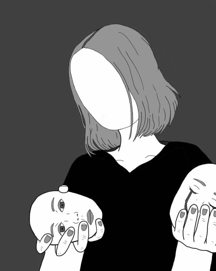
Exhibition TextTitle: Face Shop
Medium: Digital Illustration Size: 30.69 in x 38.47 in Time of Completion: December 2018 Inspired by both German Expressionist: Kӓthe Kollwitz, as well as Cubist artist: Pablo Picasso, Face Shop intends to highlight the sorrows and despairs associated with dissociation. Furthermore, this piece intends to abstractly exemplify an identity crisis, as shown by the presence of multiple expressions the figure is considering to “wear” in the illustration. Similarly to Picasso, Face Shop utilizes harsh contrasts and distorted figures to emphasize the severity of an identity-related crisis. |
Critical Investigation/Artistic Inspiration
|
My artistic inspiration primarily stems from the German Expressionism movement, of which took place during the approximated years of 1905 to 1920. During its peak, this movement went widespread throughout a majority of Europe, and focused on intense feelings of anxiety as well as disconnection from the outside world. These feelings of both loss and anguish within this movement influenced the common usage of distorted figures that consisted of rugged lines and shapes in most artwork. Such abstract shapes encapsulated the despair throughout the movement in a different light than previously known in other artistic movements.
The German Expressionist movement had several, varying, kinds of mediums within it. Yet I specifically felt inspired by the woodcuts created during this time. The main reason I felt inspired by these woodcuts was due to the fact that both mediums of work required carving as a form of manipulation. It was after this discovery that I decided to continue my research on woodcuts; in order to see what I would be capable of creating based on the materials needed for this kind of artwork. This is when I came across German Expressionism artist: Kӓthe Kollwitz, and her multiple, complex woodcuts. Born in 1867, Kӓthe Kollwitz was a German artist who created both prints and sculptures in attempts to tackle the commonplace injustice within her country. One notable characteristic of Kollwitz is that she often allowed the surrounding conflict in both Europe and her personal life to influence her art. A primary example of this influence being the death of Kollwitz's son in 1914. Of which resulted in the mass production of prints that displayed mothers desperately attempting to protect their children. The use of jagged lines, and angular shapes within her woodwork pieces were the main influence on my work; as these shapes and cuts had been used to showcase loss in very distorted methods. Which is what I aspired to portray through my digital illustration. While, in addition, the use of negative and positive space within these woodcuts also further helped me develop techniques to make my own artwork successful. The wood-works that most inspired my piece are: The Volunteers, as well as Visit to the Hospital, created in 1922 and 1929 respectively. Simple sketches created by Kӓthe Kollwitz were additional sources of inspiration for my illustration. Primarily, I felt that the usage of high contrasts and emphasis within these pieces influenced the layout of my project’s design. However, these sketches did not provide the majority of inspiration for my artwork. Yet the specific sketches that I felt most influenced by included, Woman Working in Profile Facing Left, (1903) Self-Portrait, (1927) and an additional Self-Portrait. |
|
Planning Phase
|
Planning Sketch #1
Planning Sketch #2
Planning Sketch #3
|
During the very early portions of my planning phase, I actually expressed the desire to create a piece that generally centered around the theme of loss and decay. As a result, I initially researched common symbols for such themes, and found myself looking into quite literal embodiments of such concepts: skulls. Feeling that skulls would clearly communicate the themes I wished to work with, I started creating practice sketches of various structures I thought would be the most visually pleasing, while similarly being simple enough to successfully work with - and furthermore manipulate - within the allotted time period for this project. Although this sketch is the most developed, I also attempted illustrating the skulls of cats, humans, and birds. Ultimately I decided to abandon this idea fairly quickly, as I felt that this theme of decay was too isolated in comparison to the previous themes I had been discussing within my other pieces. In addition to this, I found myself unable to efficiently create a possible artwork that I felt was worthy of illustrating. Concepts I had didn’t feel very complex, or on the other hand, felt overly complex to complete given my experience with the medium.
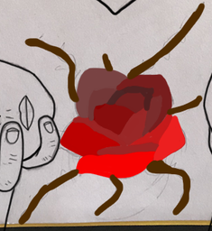
Following the abandonment of this first idea, I started reviewing older pieces in attempts to reconnect myself with my general theme that was intended to unify my works. While doing this, I took particular inspiration from my previous digital illustration What Remains, with my specific interest being centered around the theme, of which focused on exemplifying the effects of an identity crisis on an individual. From this theme, I decided to create a piece focused around identity, and furthermore the loss of it. Once the basic theme had been constructed, I started working to create a planning sketch that conveyed the message I desired to communicate. Throughout this process, I started looking into a series of paintings made by artist: Pablo Picasso, during his Blue Period, as I felt that this set of artworks were widely known for showcasing negative emotions such as sadness and emptiness. After finding pieces such as, “The Blind Man’s Meal,” (1903) and, “Self-portrait,” (1901) I was able to create my second planning sketch. Ultimately, I decided to use a figure without a face to influence a feeling of loss, while in addition to this I had the figure holding faces in attempts to convey the idea of the subject’s identity not being authentic, and furthermore the true dissociation one feels whilst suffering an identity crisis. Admittingly, my third planning sketch is a mere manipulation of my second planning sketch, of which was done in attempts to make my theme more apparent to viewers of the artwork. The rose that is now added to the shirt of this figure within this third planning sketch is a direct reference to Salvador Dali’s, “Meditative Rose,” (1958) of which is primarily believed to communicate beauty and tranquility. Throughout this planning sketch, thorns can be seen scattered around the shirt, and the rose petals have an appearance of decay. This manipulation of Dali’s artwork furthered my ability to display the destruction of the self, and additionally the literal loss of life, as I felt that it was significant for me to illustrate how much the lack of an identity impacts any given individual. Although at first I made this planning sketch my final, later on in the process of creating this piece I ended up removing the rose from my illustration entirely, as it cluttered the bottom half of the artwork and felt too obscure of a reference to amplify the piece. |
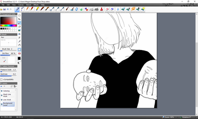
Process
|
|
|
Experimentation
Possible Shirt Design #1
Possible Shirt Design #1
|
As previously mentioned within the Planning Phase portion of my weebly, I briefly considering creating an allusion to Salvador Dali’s, “Rose Meditative,” (1958) within my artwork. However, as I started initially illustrating the wilting rose in my artwork, I quickly felt a general displeasure towards the flower’s presence within my piece. The rose made the bottom half of my illustration extremely cluttered, and it was disrupting the movement I intended to establish within my piece. Not only this, but I also felt that the rose was too obscure to include with my piece. When I asked my parents for advice on my artwork, both of them felt that the rose seemed “out of place” within my piece. This ultimately made me realize that the reference was too basic to make a significant impact on my artwork, and as a result I decided to remove it from my piece entirely.
Although I initially considered placing other objects in the spot where the rose once was, I couldn’t find anything that was meaningful enough to illustrate. As a result I simply filled in the space with black to create a the appearance of a void. Furthermore, this connected my piece to my previous artwork, as it used similar color palettes and usage of negative and positive space. |
Reflection
In general, I feel that my piece connects smoothly with my overarching theme, while it additionally works as a stand-alone artwork. However, in contrast to this, I’m not overly proud with the visually quality of the piece. Although I’m considerably new to the digital medium, I still feel considerably uncomfortable working with the human figure - especially the face - as the features that make a person look anatomically correct are considerably hard for me to illustrate. As a result of this, I feel that my technical competence suffered slightly, and in general it decreased the quality of my piece. In addition to this, I feel that the line work of my piece is a little sloppy in specific areas of the piece. With the pen size I used being considerably small, the errors are much more noticeable, of which makes the figure appear hastily drawn. Furthermore, the small pen size in contrast to the larger areas of single colors creates too much contrast, and makes the piece appear disjointed.
Despite this, as I wrote earlier, the theme within this piece is presented considerably clear. This is apparent from the distorted figures, dark hues, and heavy contrasts between the different values within the piece. All of the principles of design and elements of art combined work to present a generally negative emotion, while it also clearly expresses a theme of identity through the inclusion of multiple faces (of which are associated with the self, and self-image).
Despite this, as I wrote earlier, the theme within this piece is presented considerably clear. This is apparent from the distorted figures, dark hues, and heavy contrasts between the different values within the piece. All of the principles of design and elements of art combined work to present a generally negative emotion, while it also clearly expresses a theme of identity through the inclusion of multiple faces (of which are associated with the self, and self-image).
Connecting to the ACT
1) Clearly explain how you are able to identify the cause-effect relationship between your inspiration and its effect upon your artwork.
2) What is the overall approach (point of view) the author (from your research) has regarding the topic of your inspiration?
3) What kind of generalizations and conclusions have you discovered about people, ideas, cultures, etc. while you researched your inspiration?
4) What was the central theme or idea around your inspirational research?
5) What kind of inferences (conclusions based on your evidence and reasoning) did you make while reading your research?
- It is through the use of line - and several organic shapes - within my artwork that a visible connection to the subjective German Expressionist movement can be made. While additionally the usage of both negative and positive space within my piece can show inspiration from German Expressionist artist Käthe Kollwitz. In addition to this, the theme of suffering and loss through my piece also reflects common themes being reflected through this movement.
2) What is the overall approach (point of view) the author (from your research) has regarding the topic of your inspiration?
- Throughout my research, several authors discussed the various connections between Käthe Kollwitz’s personal life and her artwork. Yet authors also commonly discussed how the tragedies of the surrounding world affected the messages presented through the German Expressionist movement in general.
3) What kind of generalizations and conclusions have you discovered about people, ideas, cultures, etc. while you researched your inspiration?
- The primary conclusion that I discovered through my research was that a majority of art from the German Expressionist movement was affected by the emotions felt throughout Europe at the time. While additionally, I came to the conclusion that war was a common topic of protest throughout this movement; primarily being the protest of war.
4) What was the central theme or idea around your inspirational research?
- The central theme that I focused on throughout my inspirational research was the presentation of loss and general suffrage. It was ultimately the idea of being able to show such pain and a loss of personality that motivated me to see how Käthe Kollwitz presented multiple emotions through her works. The contrast of emotions throughout her pieces appealed to me immensely.
5) What kind of inferences (conclusions based on your evidence and reasoning) did you make while reading your research?
- Through the research and readings I conducted I was able to determine that it is through both the texture of lines as well as the contrast in color that German Expressionist pieces are able to express such intense feelings of despair and anxiety. These feelings can be especially expressed through the woodcuts from artists such as Käthe Kollwitz, as she has had firsthand experience with these emotions of pain and suffering.
Bibliography
“The Drawings of Käthe Kollwitz.” The Drawing Source, www.thedrawingsource.com/kathe-kollwitz.html.
-
The Editors of Encyclopædia Britannica. “Käthe Kollwitz.” Encyclopædia Britannica, Encyclopædia Britannica, inc., 28 Apr. 2017, www.britannica.com/biography/Kathe-Kollwitz.
-
“Expressionism Movement, Artists and Major Works.” The Art Story, www.theartstory.org/movement-expressionism.htm.
-
“German Expressionism (C.1905-35).” German Expressionism Art Movement, www.visual-arts-cork.com/history-of-art/german-expressionism.htm.
-
“Käthe Kollwitz | Self Portrait (1927) | Artsy.” Artsy - Discover, Research, and Collect the World's Best Art Online, www.artsy.net/artwork/kathe-kollwitz-self-portrait.
-
“National Museum of Women in the Arts.” Käthe Kollwitz | National Museum of Women in the Arts, nmwa.org/explore/artist-profiles/k%c3%a4kollwitz?gclid=Cj0KCQjw6NjNBRDKARIsAFn3NMqDIT9yixFq4Xei8DZQBKgYPxJN57P8j18UBbKnPBdNJS0l0sOSE18aAvvrEALw_wcB.
-
Nydam, Anne E.G. “Käthe Kollwitz, Superprintmaker.” Black and White, nydamprintsblackandwhite.blogspot.com/2011/05/kathe-kollwitz-superprintmaker.html.
-
“Selbstbildnis (Self-Portrait).” British Museum, www.britishmuseum.org/research/collection_online/collection_object_details.aspx?objectId=684862&partId=1.
-
“Selbstbildnis Von Vorn (Self-Portrait from the Front) - Käthe Kollwitz.” FAMSF Explore the Art, 22 Apr. 2016, art.famsf.org/käthe-kollwitz/selbstbildnis-von-vorn-self-portrait-front-54945.
-
The Editors of Encyclopædia Britannica. “Käthe Kollwitz.” Encyclopædia Britannica, Encyclopædia Britannica, inc., 28 Apr. 2017, www.britannica.com/biography/Kathe-Kollwitz.
-
“Expressionism Movement, Artists and Major Works.” The Art Story, www.theartstory.org/movement-expressionism.htm.
-
“German Expressionism (C.1905-35).” German Expressionism Art Movement, www.visual-arts-cork.com/history-of-art/german-expressionism.htm.
-
“Käthe Kollwitz | Self Portrait (1927) | Artsy.” Artsy - Discover, Research, and Collect the World's Best Art Online, www.artsy.net/artwork/kathe-kollwitz-self-portrait.
-
“National Museum of Women in the Arts.” Käthe Kollwitz | National Museum of Women in the Arts, nmwa.org/explore/artist-profiles/k%c3%a4kollwitz?gclid=Cj0KCQjw6NjNBRDKARIsAFn3NMqDIT9yixFq4Xei8DZQBKgYPxJN57P8j18UBbKnPBdNJS0l0sOSE18aAvvrEALw_wcB.
-
Nydam, Anne E.G. “Käthe Kollwitz, Superprintmaker.” Black and White, nydamprintsblackandwhite.blogspot.com/2011/05/kathe-kollwitz-superprintmaker.html.
-
“Selbstbildnis (Self-Portrait).” British Museum, www.britishmuseum.org/research/collection_online/collection_object_details.aspx?objectId=684862&partId=1.
-
“Selbstbildnis Von Vorn (Self-Portrait from the Front) - Käthe Kollwitz.” FAMSF Explore the Art, 22 Apr. 2016, art.famsf.org/käthe-kollwitz/selbstbildnis-von-vorn-self-portrait-front-54945.
