MIAD Illustration (Negative)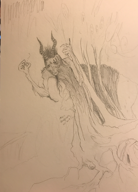
|
Exhibition TextTitle: Consumption
Medium: Pencil on Illustration Board Size: 38.1 cm x 25.5 cm Time of Completion: November 2017 Consumption is a pencil on illustration board piece, of which focuses on conveying the idea of fear being able to downright consume an individual, and transform them into an unrecognizable monster. This piece was heavily inspired by Arthur Rackham’s works, with specific poses being directly referenced from his works in the Grimm Fairy Tale illustrations book. Additional inspirations come from the Romanticism movement, which showed the revival of Gothic horror stories, as well as dramatic scenes. |
Critical Investigation/Artistic Inspiration
|
The artistic inspirations for this illustration piece were primarily derived from the collection of illustrations within Wilhelm Grimm’s, “Grimm's Fairy Tales,” of which were created by artist: Arthur Rackham. Born in 1867, Arthur Rackham was a British artist most widely renowned for his highly detailed, illustrated works. With some of his first illustrations being created in 1893, Rackham’s work showcased several enchanting scenes from multiple series of classical fiction as well as children's literature. Rackham ultimately desired to capture and produce illustrations with extremely intricate detail, while also desiring to convey the apparent themes and emotions being presented within the literature he commonly worked with.
This British illustrator primarily utilized the newly developed halftone process within his works, of which is a printing technique in which an image is broken into multiple dots that capture the varying tones within a piece of artwork. These dots are then broken up by the screen that has been inserted on top of an exposed plate that ultimately creates a considerably detailed image. However, aside from his ability to utilize the halftoning process, Rackham generally used watercolors within his pieces. It was this combined usage of both color and lineart that most influenced me to investigate the works of Arthur Rackham. Rackham’s work has immense detail within it, which I also felt appropriately matched the amount of detail I strive to achieve throughout this project. The Arthur Rackham Grimm fairy tale works that I specifically used as inspiration for this piece included illustrations within: “The Old Woman in the Woods,” “Fitcher’s Bird,” and “Snow White and Rose Red.” Although I ultimately only used a select few illustrations from each story. In addition to Arthur Rackham, my illustration piece was also similarly inspired by the works within the Romanticism movement, of which occurred between the years of 1780 to 1830. The Romanticism movement primarily focused on reviving the characteristics of medieval romances, gothic literature - with particular interest in gothic horror stories -, and gothic architecture. However, Romanticist artists were also heavily interested in conveying the idea that emotions and sense perception were equally important within artworks, opposed to art being focused on simple design algorithms. Furthermore, I felt that this intense amount of emotion being portrayed within Romanticism pieces would benefit the themes and designs being presented within my own illustration. As the contrasting emotions being expressed within each piece would further develop a distinct difference between the negative and positive environments of this project. The Romanticism movement still had a plethora of lasting effects on Europe even past the official “end” of the movement itself. This is apparent as works following the movement up until the 20th century still continued to heavily showcase aspects of Romanticism artworks. Furthermore, it’s apparent that this movement even slightly influenced the works of Arthur Rackham himself. Yet, aside from Rackham, Romanticism works that influenced me include, “Crossing the Brook” by Turner, “Snow Storm: Hannibal and His Army Crossing the Alps” also by Turner, and “The Oxbow” by Thomas Cole. |
|
Planning Phase
|
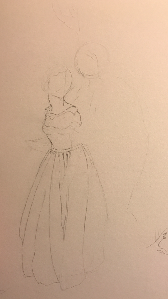
When I started this process, I desired to stick to my common theme of abstractly showcasing human emotion. This initially allowed me to easily brainstorm ideas for my illustration. This first image is an example of one of my intial sketches. The full image was intended to display a girl sitting on the moon, and animals were going to be surrounding her. This sketch was primarily intended to showcase expression as well as the imagination present within most individuals. Although it didn't connect too strongly to my overlapping theme, I felt passionate about the piece visually. Yet, as the process went on, I was at one point recommended to make the connections between my illustration and my inspiration pieces stronger. This influenced me to try other possible sketches, and I ultimately had to scrap this idea.
Although the second and third images aren't necessarily planning sketchs, they are intended to showcase the texture I created within my final piece. These specific images were created with colored pencils, and are representations of the water in my final piece. While creating this texture, I had already discovered the Arthur Rackham piece that I desired to use as my inspiration. As a result of this, I was then able to begin planning out the individual aspects of my piece, and furthermore I began designing the water within my illustration. I wanted to explore how color affected the mood of the piece, and additionally, I desired to see how the texture of the waves could alter the mood with my piece. Although these images are not in my final sketch, I referenced them frequently throughout the creation of my final piece. |
Process
|
After creating a sketch that I felt confident with, I then made the stylistic decision to actually reverse the image through the use of tracing paper. I decided to do this because my final sketch was the intended product of my final print. By this I mean that I purposefully wanted the plague doctor to reside on the right side of the print, and so I took an extra step to ensure that this could happen. I reversed this sketch by taking a sheet of tracing paper and first sketching out the original image. Then after the sketch was copied, I was simply able to flip the paper over and copy this side onto the block print instead. This was possible only because tracing paper is considerably translucent, and I was able to see through it for transferring easily. By reversing the image I was also able to ensure that no hidden errors were within my piece, as I was able to analyze my sketch through a new perspective.
Once the image had been reversed, I decided to print out a copy of the new sketch. It was after this that I began the process of transferring my image onto my block print. To do this, I covered the entire back of the image with a thick layer of graphite. Then I taped the image down onto the block print and sketched over the lines to copy the image onto the block. This process works because the graphite on the back of the image leaves an impression on the paper when my pencil places pressure on top of the individual lines. This is what allowed me to easily replicate my sketch through carving. Since I had never had any past experiences with block prints, I decided to begin my carving in the areas with large amounts of negative space. This provided me with a buffer period of carving, as within these areas of future negative space, I would have room for possible error opposed to the areas of my print that had more precise details. This area was primarily the beak on the plague doctor, yet as I felt more confident with my carving skills, I began to experiment with some of the smaller areas/lines along the cowl and hat. During this process, I also ensured to keep my carvings close to the surface. This prevented the possibility of creating holes within my block print, while also allowing me to create the scratchy texture along the mask later on. After almost entirely completing the plague doctor outline, I started to carve the background of my piece. This process wasn’t as easy to complete, as the thin lines were harder to actually carve out. While additionally the roses took very precise movements, and were ultimately saved for last. It was during this time that I also decided to deepen some of the cuts I had made earlier. This was done to prevent ink from filling in the entire block print, and created the visible gap between the negative and positive space within my piece. Once my carving had been completed, I began the printing process by taking a portion of ink and using a small paint roller to disperse it around a flat metal sheet. This process involved rolling over the dab of ink multiple times to sufficiently spread it around the metal surface. Spreading the ink around also further prevented possible clumping, and allowed me to place thin coats of this ink on my piece without having to worry about the carving wells overflowing. Using the same paint roller from earlier, I would transfer the ink from the metal sheet onto the block print gradually. Such a gradual process was done to create even coats of paint along the different sections of the artwork. It was after this inking process that I was finally able to create my prints. To do this I would take a single sheet of paper and simply lay it on top of the inked block print, while being sure to center the paper with the print. After the paper had been centered on top of the print, I would then take a plastic baren and push the paper against the block. This would force the ink on the block print to transfer onto the paper in thicker amounts, which ultimately lead to more detailed images. Yet if the baren was pushed too hard against the block, the ink would sometimes overflow into the carved wells and it would destroy the overall quality of the piece. In contrast to this, not placing enough pressure on the baren would create a spotty image that lacked detail overall. It was only through a process of repeated printing that I could successfully determine how hard and for how long I would need to push the baren into the rubber block to create a decent print. (Of which I determined to be hard pressure for an approximate 4 minutes) To ensure that each area of my print was evenly inked I would move vertically and horizontally with the baren and push pressure into the paper as I went along. Finally, after my prints had all been completed, I laid them out along the class’s drying rack for a few hours in order to keep the ink from leaking into the other pages. |
|
Experimentation
Throughout the process of creating this MIAD illustration, I primarily focused on experimenting with color in attempts to showcase certain emotions within my piece. When I was initially assigned this project, I had desired to use my set of colored pencils, as I had previous experience with the medium, and felt confident in my skills to manipulate the materials in order to create a considerably successful illustration. However, as I continued to develop the pencil sketch of my illustration, I instead decided to try using watercolors opposed to colored pencil. I ultimately made this decision as a result of my desire to continue experimenting with new artistic mediums. My previous experiences in relation to new artistic mediums (such as my block print and dry point projects) allowed me to gain a plethora of knowledge considering the different kinds of artworks, and I found myself enjoying the opportunity to explore these different mediums in art. This thought process resulted in me gathering a set of watercolors to use as the primary source of color within my illustration, as I again desired to learn about an entirely new medium.
However, actually coloring in my illustration piece went quite differently than I had hoped. Initially I attempted to create a sense of texture with these colors through the deliberate creation of watercolor streaks, of which can be accomplished by quickly ghosting my paint brush across the illustration board multiple times. I primarily attempted this technique along the sky of my positive illustration, but I never really tried it anywhere else, as these streaks slowly began to make the white behind them appear unfinished. So instead I attempted to fill in as much space in the sky as possible to prevent the piece from looking generally unfinished. By filling in this space, however, my illustration began to resemble my inspiration pieces more, as Arthur Rackham and the several Romanticism artists left as little white in their pieces as possible.
Following this attempt to create texture, I decided to then fill in my piece as much as possible. Yet, in order to create a sense of contrast and value, I then decided to try shading with my watercolors. However, as I continued to color my piece in, I realized that it would take a considerably large amount of watercolor layers in order to create the shading I desired. In one particular portion of this piece, I continued to apply layers of watercolor in attempts to see the amount of layers needed in order to create noticeable contrast and value. Yet, as I continued to color in my piece, the illustration board began to dampen and peel, as the large amount of watercolors ultimately drenched my piece. After noticing this, I then decided to abandon the idea of creating value, as I risked destroying my entire piece.
In the end, I primarily stuck to experimenting with color alone, as my other attempts to create additional detail failed. I used this color to showcase contrasting emotions, as fear can always exist even if an individual doesn’t feel it in the moment (as showcased by the ominous sky within the background). Additionally, I attempted to create a sense of warmth and comfort by coloring the sea pink. Yet, I ultimately feel that this idea of warmth and comfort wasn’t portrayed strongly enough through the use of colors, and that I needed additional elements to showcase the ideas I had.
Reflection
Generally, I actually have considerably mixed emotions on this final illustration piece. Although I do believe my piece did successfully convey the proper themes and concepts as I had planned, I’m ultimately underwhelmed by the overall structure and format of this artwork. The attempted shading in the background of the piece moreso looks unfinished, rather than appearing transparent as I had intended. Yet, it is worth noting that I am predominantly pleased with the detail captured within the foreground of this particular illustration. However, at the same time, I feel that this contrast in detail between the foreground and background of my piece contributes to the overall unfinished look of the work. In relation to my inspiration pieces, I feel that I followed the formatting of the original Arthur Rackham pieces too closely; yet I also feel that a similarity in detail between the two pieces was lost. His use of line to stimulate emotion was considerably intricate, while my use of line is less detailed and consistently not as elaborate.
Additionally, prior to the creation of this work, I experimented with the usage of watercolors on paper. Yet in the end I ultimately believe that I didn’t experiment with these watercolors enough, as my positive illustration piece lacks refinement within the details that have been completed in watercolor. This lack of refinement ended up frightening me, and I simply rejected the thought of using colors on my negative illustration. It was this decision that resulted in an uninteresting piece, as the details presented in pencil (in my opinion) were not enough to create movement and drama within the piece. The next time I work in this medium, I will be sure to slowly introduce new techniques, opposed to heavily experimenting with them on my final artwork. This way I can ensure my piece will not suffer from admittingly odd mistakes, and furthermore, this will ensure that I don’t scare myself too much at my piece’s expense of quality.
In contrast to my opinions on my final artwork itself, I do feel considerably happy with the final product of my Weebly. I believe that I showcased a balanced critique of my work in comparison to both my originally planned final product, as well my inspiration pieces. Additionally I feel that my website contains a very detailed description of my overall process and experimentation, and I also provide a wide variety of pictures to encapsulate the exact methods I used throughout this work period in attempts to create a successful set of illustrations. Although I do desire to possible “redo” my illustrations themselves, my website will remain considerably the same in relation to overview and formatting.
Connecting to the ACT
1) Clearly explain how you are able to identify the cause-effect relationship between your inspiration and its effect upon your artwork.
2) What is the overall approach (point of view) the author (from your research) has regarding the topic of your inspiration?
3) What kind of generalizations and conclusions have you discovered about people, ideas, cultures, etc. while you researched your inspiration?
4) What was the central theme or idea around your inspirational research?
5) What kind of inferences (conclusions based on your evidence and reasoning) did you make while reading your research?
- Primarily, it is through the use of line, contrast, and value that I establish in-depth connections between my illustration and my inspiration pieces. This usage of line, contrast, and value can primarily be observed within Arthur Rackham’s illustration pieces (as his work uses shading and line art to present emotions), yet similarly can be found within certain Romanticism artworks. While in addition to this, my piece attempts to utilize emotion and drama in order to successfully communicate ideas of theme, of which closely resembles the techniques used within the Romanticism art movement.
2) What is the overall approach (point of view) the author (from your research) has regarding the topic of your inspiration?
- The authors I referred to throughout this research process typically relied on creating connections between the detail present within Arthur Rackham’s pieces, and his use of both the halftoning process and the process of using watercolor within his works. Most articles I investigated heavily focused on the physical aspects of his works, and generally lacked when it came to created connections between common themes and emotions being expressed within Rackham’s artwork.
3) What kind of generalizations and conclusions have you discovered about people, ideas, cultures, etc. while you researched your inspiration?
- Primarily, I have come to the conclusion that Romanticism focused on attempting to reshape the methods in which artwork is expressed. Specifically, Romanticism attempted to utilize drama and sense perception in order to efficiently showcase strong emotional aspects of artwork. While additionally, Arthur Rackham was one of the first illustrators to consistently use the halftoning process in order to create his highly detailed pieces.
4) What was the central theme or idea around your inspirational research?
- The central theme that I focused on throughout my inspirational research was the dramatic and intense presentation of fear having complete dominance over an individual. Arthur Rackham’s illustrations throughout the Grimm Fairy Tales books ultimately showed me various methods of using contrast, line, as well as value to develop and present different emotions within my work. Yet, it was throughout my investigation of the Romanticism movement, that I was able to see how drama is similarly used to place emphasis on certain emotions within the piece.
5) What kind of inferences (conclusions based on your evidence and reasoning) did you make while reading your research?
- Throughout the process of conducting research, I determined that a considerable amount of the readings I had been exposed to promoted the idea of using line, contrast, and value to efficiently portray a set of positive or negative emotions. Additionally, it was through these readings that I discovered how heavily - and successfully - the Romanticism movement utilized drama and intense scenery to showcase certain emotions through the piece, that lineart alone would usually not be able to accomplish.
Bibliography
“Arthur Rackham Fairy Tale Illustrations.” Rackham Fairy and Fairy Tale Art (Arthur Rackham), www.artpassions.net/rackham/rackham.html. Accessed 14 Nov. 2017.
-
“Artist's Birthday: Arthur Rackham.” The Oxford Astrologer, 22 Sept. 2016, www.oxfordastrologer.com/2016/09/artists-birthday-arthur-rackham.html. Accessed 20 Nov. 2017.
-
The Editors of Encyclopædia Britannica. “Arthur Rackham.” Encyclopædia Britannica, Encyclopædia Britannica, inc., 6 Mar. 2017, www.britannica.com/biography/Arthur-Rackham. Accessed 13 Nov. 2017.
-
Popova, Maria. “Arthur Rackham’s Rare and Revolutionary 1917 Illustrations for the Brothers Grimm Fairy Tales.” Brain Pickings, 1 Mar. 2016, www.brainpickings.org/2016/02/29/arthur-rackham-brothers-grimm/. Accessed 13 Nov. 2017.
-
“Romanticism Movement, Artists and Major Works.” The Art Story, www.theartstory.org/movement-romanticism.htm. Accessed 14 Nov. 2017.
-
“Small Print: Arthur Rackham's Fairy Tales, The Old Woman in the Wood.” Tales for Tadpoles, www.talesfortadpoles.ie/products/small-framed-print-arthur-rackhams-fairy-tales-21. Accessed 14 Nov. 2017.
-
“Artist's Birthday: Arthur Rackham.” The Oxford Astrologer, 22 Sept. 2016, www.oxfordastrologer.com/2016/09/artists-birthday-arthur-rackham.html. Accessed 20 Nov. 2017.
-
The Editors of Encyclopædia Britannica. “Arthur Rackham.” Encyclopædia Britannica, Encyclopædia Britannica, inc., 6 Mar. 2017, www.britannica.com/biography/Arthur-Rackham. Accessed 13 Nov. 2017.
-
Popova, Maria. “Arthur Rackham’s Rare and Revolutionary 1917 Illustrations for the Brothers Grimm Fairy Tales.” Brain Pickings, 1 Mar. 2016, www.brainpickings.org/2016/02/29/arthur-rackham-brothers-grimm/. Accessed 13 Nov. 2017.
-
“Romanticism Movement, Artists and Major Works.” The Art Story, www.theartstory.org/movement-romanticism.htm. Accessed 14 Nov. 2017.
-
“Small Print: Arthur Rackham's Fairy Tales, The Old Woman in the Wood.” Tales for Tadpoles, www.talesfortadpoles.ie/products/small-framed-print-arthur-rackhams-fairy-tales-21. Accessed 14 Nov. 2017.
