Digital Collage
|
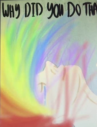
Exhibition TextTitle: Why Did You Do That?
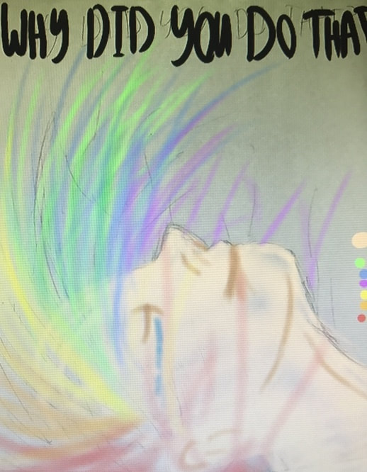
Medium: Digital Collage Size: 60.96 cm x 91.44 cm Time of Completion: March 2018 Heavily inspired by the Fauvism Movement, Why Did You Do That? Intends to portray the chaos and other negative effects of a carefree lifestyle. The mixed usage of vibrant colors and sharp contrasts aim to make the image appear distorted, and furthermore aim to make the viewers feel almost sore when looking at this digital collage. This effect represents an idea of fatigue and dejection that one may experience after spending endless hours partying or engaging in potentially dangerous activities. |
Critical Investigation/Artistic Inspiration
|
A large majority of my artistic inspiration originates from the Fauvist art movement, of which primarily took place between the years of 1899 and 1908. This twentieth-century movement is heavily characterized by a combination of vibrant colors, simple shapes, as well as harsh brushstrokes, of which are commonly mistaken for Impressionist work. Fauvism is typically classified as being an extensive and extreme post-Impressionism movement, as there are several shared artistic aspects between the two movements. Yet, the Fauvist movement is also commonly compared to the German Expressionism movement, as the two movements primarily took place during the same time period. Yet, the Fauvist movement - unlike the German Expressionism movement - predominantly took place within France, and is generally only associated with a few select artists. These artists, although also referred to as “Les Fauves” (the wild beasts), heavily focused on presenting abstract representations of emotion through various bright and emotive colors, as well as simplistic designs. Well-known artists from the Fauvist movement include: André Derain, Diane Bolinger, Henri Matisse, and Vincent Van Gogh.
It was this peculiar and abstract presentation of emotions that ultimately influenced me to further investigate the Fauvist movement. Coincidentally, this idea of an abstract representation of emotions is also an overlapping theme throughout several different pieces of mine, and I felt that the message within my project would only become more vibrant if I was able to connect it to an artistic movement with a similar message. Additionally, during this investigation process I consistently focused on the idea that this would be my first large-scale painting. Furthermore, I focused on the idea that I wanted to provide some leeway for myself to explore this considerably new medium, while simultaneously ensuring that I would be able to create a visually appealing portrait for the class. This repeated thought only strengthened my desire to investigate the Fauvism movement, as I felt that the simple shapes within my inspiration pieces would provide some level of flexibility within my work, while also allowing me to explore the manipulation of these shapes in order to create a successful collage. Following this decision to use the Fauvism movement as my primary artistic inspiration, I began to investigate individual artists from the movement. This was done in order to intensely explore the different trends, styles, and techniques presented within the various works of artists that specialized in the movement, as I wanted to gain a good grasp on what I would be capable of creating during the time provided to complete this project. Ultimately, I decided to take primary inspiration from works created by artists: André Derain and Diane Bolinger. André Derain - of which was born in 1880 - is commonly associated with his Fauvist portraits, yet a majority of his pieces are considered to define the Fauvist movement itself, as he was a heavy contributor to the initial ideas presented within the movement. Diane Bolinger, on the other hand, is a significantly newer artist, of which similarly focuses on using Fauvism within her paintings. |
|
Planning Phase
Planning Sketch #1
Planning Sketch #2
Planning Sketch #2 (Final)
|
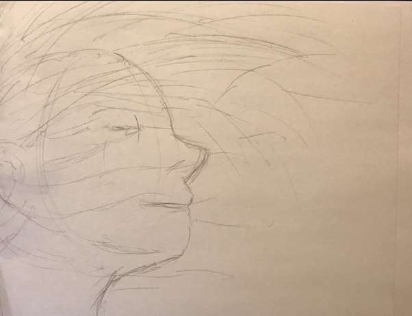
Following my research phase, I began to develop sketches that could easily incorporate the Fauvism look I desired to showcase. However, finding legitimate themes that were both complex and refined at the same time was considerably difficult. A majority of the themes that I originally brainstormed seemed cluttered, or in contrast, extremely simple. I had several ideas for possible pieces, but ultimately would be forced to ditch an idea because the corresponding theme I had assigned to the image. This was the primary issue with the first sketch I had developed. Before I had really planned out a possible theme, I decided to create a sketch for this idea that I intended to incorporate into the final piece. Yet, as I started to evaluate possible themes (i.e. sadness, depression, anger) I realized that this piece was going to be way too simple for my liking. So I ultimately decided to scrap the idea, because I could never get past the first few simple concepts I had planned to convey within my piece.
Following the creation of my first sketch, I then created this digital sketch on a different drawing program known as Smooth Draw 3. This sketch was detailed, and displayed a very desirable amount of intricacy that I intended to have within my piece. However, I ultimately decided not to use this piece, as I felt that I couldn’t properly develop an in-depth theme for the piece. Although I was considerably proud with the look of the piece, I was not very happy with the idea of trying to force together themes just so I could create a technically beautiful artwork. In addition to this, this sketch looked as if it would take too long to successfully complete in the given timeframe. Thus, I ultimately decided that it would be a better decision to continue searching for better ideas. It was after I ditched this idea that I realized I had an old sketch for a dry point that I never ended up using. After I found it again, I dug through my old Weebly pages and deciphered my notes to see if I could edit the theme for this piece. Luckily, I felt an immediate connection to this piece, and was already beginning to develop ideas for the final project. It was because of this that I ultimately decided to settle for a slightly complex theme. Although, I initially desired to make this piece inspired by the Pop Art movement, but instead shifted my focus to make the piece follow the Fauvism movement instead. This was because I felt that the Pop Art movement is extremely overdone, and I wanted to set myself apart from my classmates by choosing a less common art movement. |
Process
|
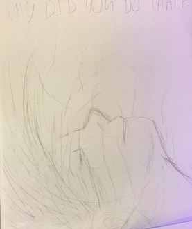
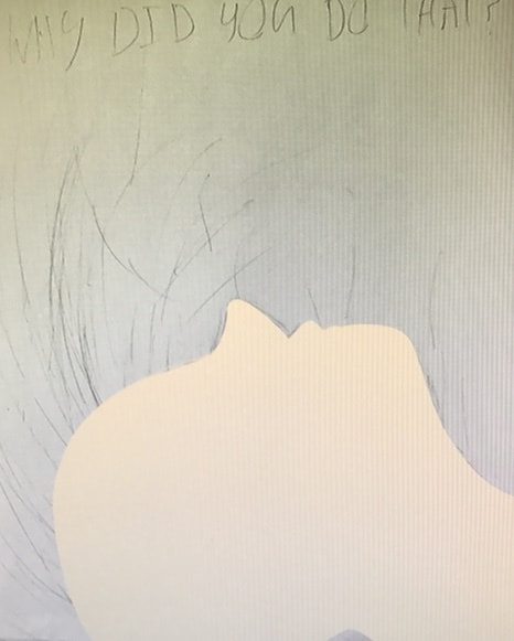
Following the decision to reuse an old planning sketch from my dry point project, I decided to begin working on the creation of my final digital collage. However, before I could begin any digital work, I had to ensure my planning sketch - of which would later be used as a guide to essentially color my piece in - was accurate and detailed enough to be a useful outline for my artwork. To edit this piece, I turned the paper on its side, so that I could see a different perspective of my piece to pinpoint undesirable features of my work. Furthermore, this allowed me to see if my piece looked anatomically correct (as the main figure within the piece is a human) and furthermore if the individual in my digital collage was recognizable as a person. To edit this planning sketch, I would simply use pencils and erasers to edit and fix certain lines along my sketch. This process didn’t take extremely long, as I knew that any minor issues within my sketch would easily be covered up with the usage of photoshop tools.
Once my sketch had been sufficiently edited to my liking, I simply uploaded the image to my computer by scanning it, and then inserted the photo in the Photoshop program. Doing this caused my Photoshop project to automatically select a specific size and resolution, but after editing the settings and overall proportions of my piece, I was essentially able to stretch the image so that it better fit my screen, and furthermore matched the proportions we were recommended to use at the beginning of this project. After the proportions and resolution of my image had been selected, I started filling in my image by locating a decent skin tone to outline the figure within my piece. Although I realized that the hair within my sketch would cover up a majority of the skin I was coloring at the time, I decided that it would be better to ensure no “holes” would be present within my piece later on. By this I mean that I wanted to ensure the figure looked anatomically correct, so I filled in her figure as if no hair was going to be added later on. This way, if the hair I added latter didn’t completely cover a portion of skin I desired it to, the individual would still look realistic, opposed to incomplete and jagged. I started filling in the figure by outlining her nose, mouth, forehead, and neck, and then I gradually started working my way into the center of the figure by increasing the brush size. At this point I decided it would be safe to begin editing and coloring the hair of the figure within my digital collage. I started this process by outlining where each color within the hair would begin and end. I was able to outline this through the usage of a small brush size, of which I would use to create individual strokes along my piece. As I made my way along the figure, I would gradually change the color of my tool, so that it created a smooth transition from one hue to the next. As I continued working on my digital collage, I would go back and keep adding more individual strokes on top of the previous ones, of which created a layering effect of sorts. This layering effect made the hair look complex and thick, opposed to flat and unrealistic. With each brush stroke - of which varied in length - I would follow a specific curve (or direction more accurately) that I distinctly outlined within my planning sketch. Following this direction not only created a sense of movement, but also made the figure appear to be falling. This made my piece more dynamic, and would later allow a viewer’s eyes to be guided across the various aspects of my piece. During this point in time, I also started creating the words “Why Did You Do That?” Along the top of the screen. This was done to emphasize my theme of regret and consequence as a result of living a carefree and wild lifestyle. It was because of this that I decided to make the words black, as it not only contrasted the fun and lively colors presented within the remaining piece, but it also showcased a heaviness and added a sense of dread to my piece. The lack of color additionally added a serious tone to my overall artwork. As I continued to work, I added more lines to the figure’s skin within the piece. This was simply done to outline shapes along the body, and to add to the anatomical shape of the individual. During this time I also added tears to the figure, of which added to this feeling of regret and sadness that I intended to convey within my piece. It was admittingly hard to do this without my planning sketch being present, as the base skin color completely covered the outline. Although I was able to refer to my planning sketches for help outside of Photoshop, I feel that the overall look of this piece was diminished because I could not accurately line up specific proportions of my figure. Once the final details had been added to both the hair and skin of the figure, I downloaded the final image as a jpeg to my desktop, and upload it onto a flash drive so that I could transport the image to another computer in decent quality if I needed to. I also created a less detailed image to post onto Weebly, as the more refined image was too big of a file to successfully download on this site. |
|
Experimentation
Positioning Idea #1
Positioning Idea #2
|
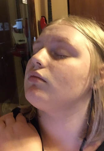
When initially developing the planning sketch for this piece, I experimented with the posing of the figure within the piece, to ensure that I could have the most dynamic - yet not overly complicated - design. The different positions that can be seen here were my attempts at revising the original planning sketch once I found the sketch again at the beginning of this project. I desired to revise the design of my planning sketch, as it was originally created with the intention to be made into a dry point piece, opposed to a digital collage. However, as I continued to explore different posing for this piece, I felt that my original concept would ultimately be the best format for a digital collage as well, as the positioning was dynamic, and left room for additional elements to be implemented into my piece.
The different poses were used in attempts to experiment with differing values of light, and furthermore to experiment with movement within my piece. While the middle piece was deemed to simple, and was therefore rejected as a possible position, the other two poses were considered to be too complex, and left little room for additional detail to be implemented into my work. So, as a result, I returned to my original planning sketch, and simply edited the sketch itself a little, so that I could ensure I felt confident with the overall appearance and placement of the figure. 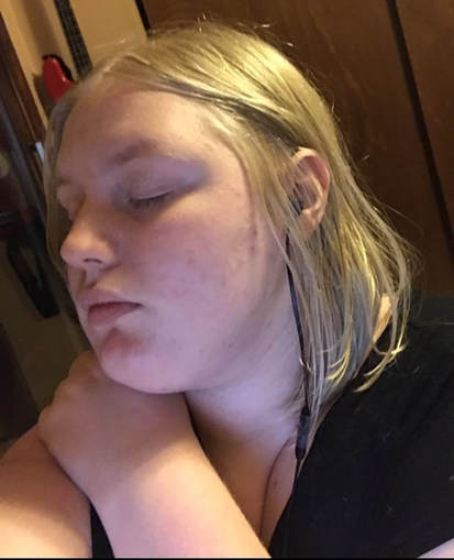
Positioning Idea #3
|
Reflection
If I’m being completely honest, I personally feel that this piece fails to convey the idea that I had originally intended it to. The vibrant colors and blurred figures don’t necessarily emphasize any specific emotions, and furthermore, the overall look of the piece feels generally disconnected from my theme. Although one can easily see this image of a carefree individual, none of the piece’s aspects have extreme emotional connections. In fact, the only portion of this digital work that could be semi-related to my theme is the stream of tears pouring from the girl’s eye. Since the figure is smiling, seeing these tears provides a nice visual cue to allow viewers to realize that this environment is causing her to suffer. Yet, if the tears were not in this piece, any viewer wouldn’t realize that there is any other emotion present aside from happiness. Overall, I feel that I could have done a better job at ensuring any given individual could see the contrasting emotions I intended to present within this piece.
In addition to this, I am also not considerably proud with the overall “look” of this digital collage. I had intended to create a blur effect that was intended to distort the image and make it harder for a viewer to observe. However, by the end of my editing session, the piece simply looked unpolished, and the blurring appeared cheap and accidental opposed to intentional. Not only this, but my recreation of a human figure seemingly struggled as well. The individual within the piece appears to be human, but I could have done more to ensure that she was more detailed, so that any viewer could immediately recognize the subject as human. However, I am proud with the appearance of the hair in this piece, as the various colors blend nicely, and create a focal point for my piece that also establishes movement. Yet, I ultimately regret not spending more time on the words at the very top of the image. Those words were essential to the piece, and although I didn’t wanted them to look typed, I could have worked to ensure they were orderly and easy to read in the piece itself. In general, I feel that I had high hopes for this project, but the execution wasn’t very strong. While similarly, my piece does not directly read as a Fauvism piece either.
In addition to this, I am also not considerably proud with the overall “look” of this digital collage. I had intended to create a blur effect that was intended to distort the image and make it harder for a viewer to observe. However, by the end of my editing session, the piece simply looked unpolished, and the blurring appeared cheap and accidental opposed to intentional. Not only this, but my recreation of a human figure seemingly struggled as well. The individual within the piece appears to be human, but I could have done more to ensure that she was more detailed, so that any viewer could immediately recognize the subject as human. However, I am proud with the appearance of the hair in this piece, as the various colors blend nicely, and create a focal point for my piece that also establishes movement. Yet, I ultimately regret not spending more time on the words at the very top of the image. Those words were essential to the piece, and although I didn’t wanted them to look typed, I could have worked to ensure they were orderly and easy to read in the piece itself. In general, I feel that I had high hopes for this project, but the execution wasn’t very strong. While similarly, my piece does not directly read as a Fauvism piece either.
Connecting to the ACT
Connecting to the ACT
1) Clearly explain how you are able to identify the cause-effect relationship between your inspiration and its effect upon your artwork.
2) What is the overall approach (point of view) the author (from your research) has regarding the topic of your inspiration?
3) What kind of generalizations and conclusions have you discovered about people, ideas, cultures, etc. while you researched your inspiration?
4) What was the central theme or idea around your inspirational research?
5) What kind of inferences (conclusions based on your evidence and reasoning) did you make while reading your research?
1) Clearly explain how you are able to identify the cause-effect relationship between your inspiration and its effect upon your artwork.
- It was primarily through the use of color, shape, and contrast I was able to establish a series in-depth connections between my self-portrait and my inspiration pieces. Specifically, it was through the use of these Elements of Art - as well as various Principles of Design - that I was able to capture the themes and general the general appearance presented within the Fauvist movement. The vibrant colors create distinct visual connections to my inspiration pieces, while the idea of using these colors and shapes to showcase emotion in abstract ways also captures a common trend in the Fauvism movement.
2) What is the overall approach (point of view) the author (from your research) has regarding the topic of your inspiration?
- Throughout my researching process, the authors I referred to typically focused on discussing the trends surrounding the more popular artists from the Fauvism movement, as well as their relationships with one other. This is in opposition to the discussion of common characteristics within the movement itself, and furthermore the discussion of the factors that specifically influenced the start of the Fauvism movement. This lack of information negatively impacted the overall success and effectiveness of my researching process.
3) What kind of generalizations and conclusions have you discovered about people, ideas, cultures, etc. while you researched your inspiration?
- Primarily, I have come to the conclusion that the Fauvism movement was a considerably short, and furthermore that this movement frequently took aspects from other movements and altered them in new ways. This can be observed through the colors from the Impressionist movement, and the harshness of line from the German Expressionism movement. Furthermore, I have realized that the Fauvism movement only consisted of a few artists, opposed to it being a wide spread movement.
4) What was the central theme or idea around your inspirational research?
- The central theme that I focused on investigating throughout my inspirational research was the abstract presentation of human emotion through various artistic elements such as shape and color. This idea is presented within certain Fauvism pieces, of which ultimately lead to me using the movement as my primary source of inspiration.
5) What kind of inferences (conclusions based on your evidence and reasoning) did you make while reading your research?
- Throughout the process of conducting research, I concluded that color, line, and shape have much larger impacts on art then I initially thought. In most paintings, we tend to overlook Elements of Art such as color and line, yet through my investigation I was able to observe how much it affects the overall appearance of the Fauvism pieces I used as my inspiration.
Bibliography
Bibliography“André Derain Biography, Art, and Analysis of Works.” The Art Story, www.theartstory.org/artist-derain-andre.htm. Accessed 17 Oct. 2017.
-
“André Derain (1880–1954) | Maurice de Vlaminck | 1999.363.83 | Work of Art | Heilbrunn Timeline of Art History | The Metropolitan Museum of Art.” The Met's Heilbrunn Timeline of Art History, www.metmuseum.org/toah/works-of-art/1999.363.83/. Accessed 14 Oct. 2017.
-
Bolinger, Diane. “Diane Bolinger Artist & Photographer.” Dianebolinger.com, www.dianebolinger.wixsite.com/bolinger/about. Accessed 14 Oct. 2017.
-
Dan. “The Fauvism Art Movement: Wild Beasts and Colorful Paintings.” Empty Easel, www.emptyeasel.com/2007/04/10/the-fauvism-art-movement-wild-beasts-and-colorful-paintings/ Accessed 16 Oct. 2017.
-
“Fauvism Movement, Artists and Major Works.” The Art Story, www.theartstory.org/movement-fauvism.htm. Accessed 17 Oct. 2017.
-
Tate. “Fauvism – Art Term.” Tate, www.tate.org.uk/art/art-terms/f/fauvism. Accessed 14 Oct. 2017.
-
“André Derain (1880–1954) | Maurice de Vlaminck | 1999.363.83 | Work of Art | Heilbrunn Timeline of Art History | The Metropolitan Museum of Art.” The Met's Heilbrunn Timeline of Art History, www.metmuseum.org/toah/works-of-art/1999.363.83/. Accessed 14 Oct. 2017.
-
Bolinger, Diane. “Diane Bolinger Artist & Photographer.” Dianebolinger.com, www.dianebolinger.wixsite.com/bolinger/about. Accessed 14 Oct. 2017.
-
Dan. “The Fauvism Art Movement: Wild Beasts and Colorful Paintings.” Empty Easel, www.emptyeasel.com/2007/04/10/the-fauvism-art-movement-wild-beasts-and-colorful-paintings/ Accessed 16 Oct. 2017.
-
“Fauvism Movement, Artists and Major Works.” The Art Story, www.theartstory.org/movement-fauvism.htm. Accessed 17 Oct. 2017.
-
Tate. “Fauvism – Art Term.” Tate, www.tate.org.uk/art/art-terms/f/fauvism. Accessed 14 Oct. 2017.
